 Omar Trujillo | March 3, 2021
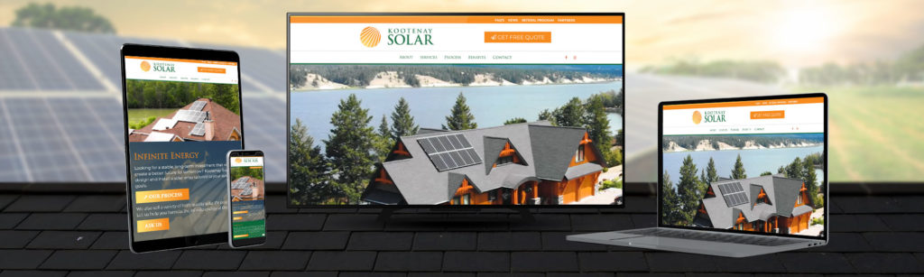
Responsive web design not only the idea of a mobile friendly design, but is a broader term used to define the designing of web pages for a variety of screen sizes and orientations. When a website is built with responsive design features, the goal is to provide an optimal viewing experience for all users, no matter what type of device they are using.
In this table we can see that the trend of mobile use is increasing, which is why it is important to implement the mobile first approach in web design.

Source: StatCounter Global Stats – Platform Comparison Market Share
If you want your users to have the best possible experience on mobile and desktop devices, designing for mobile first is the way to go. You won’t have to worry about there being mobile feature constraints, or slower loading times when using a mobile device. Google shouldn’t penalize you either, since your website will load fast from any viewing device.
Finally, taking a mobile first design approach allows you to think about what actually needs to be on your site. Instead of trying to fill in all the whitespace, you focus on what the user actually wants/needs to complete the action. In order to maintain optimal functionality, you’ll work harder to make sure your site is full of only the most critical content and features necessary to help your business succeed.